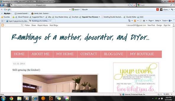
The other day I mentioned that I was redoing my blog. Because I am working on it myself, I’m sure that it does not look too professional. One thing that I have heard is that the fonts on are large. I am looking for someone to design a real header for me so bare with me on that. I was over to my sisters house earlier and when I saw my blog on her laptop I was so shocked… It looked terrible!
Is this not what you see?
I am very curious as to what it is that you guys see because on my computer everything looks fine. I guess I’ll go play around with it some more


15 comments:
i don't think anything looks terrible...NOT by a MILE...but yes, the first image you captured is what is see on my computer.
:)
i know how hard it is to get things to look "right"....this html stuff totally baffles me. making ANY sense of it is not one of my talents.
best of luck! i am sure it will look great when you get it all finished.
First of all, you are a rock star for doing it on your own, and yes that's what I see too! :)
I see it too. It looks great!
That's exactly what I see. Maybe something was wrong with your sister's computer.
That's what I see too? What's wrong it looks good?
I'm on mozilla and that's what I see, sometimes browsers are different. I like largeish fonts :)
The screen shots you posted are what I see on my browser. I use Safari on a MacBook Pro. I can also make the font larger and smaller by swiping "out" or "in" on the touchpad. Perhaps some people are swiping out too much and don't realize it?
I like the look and the added color of the Jobs quote.
Hope you are enjoying your holiday seaason
Maureen
STOP OVER THINKING THIS! Sorry I don't mean to yell, I think your blog looks great but then again we want you to be happy with it. I'm such a fickle blogger friend aren't I?! Have a terrific Thursday :)
I see what you see and like it!
Laekitha, this is what I see too, but I am not sure what you don't like. The only thing that looks a bit large is the avatars for FB,pinterest, google etc. Other than that I think it looks great. I worked with Elizabeth from the Mustard Seed blog and she did a great job for me and was a delight to work with.
xo Kathysue
It's what I see and I don't think it looks bad, don't be so hard on yourself! Janell
That's what I see and it's lookin' good! I'm using Mozilla but yeah, I think different browsers sometimes do weird things to it, but I'm not sure what you do about that so...?
Laekitha, I used to do freelance graphic design for 6 years but took off all of 2011 since I now have a "real" job as corporate Graphic Designer - my goal for 2012 is to start freelancing again... time to kick it into high gear and start saving for our Ethiopian adoption.
I'd love to do your blog header! No charge. Seriously. But this is the catch. I've never done an official blog header but I have done a few updates/changes to our work website, facebook and twitter page. Anyway, if the price is right (wink, wink), I would love doing one for you! Let me know. If you rather go with a professional blog designer, I completely understand. :)
Merry Christmas!!!
LAKEITHA! Sorry, promise to not misspell your header! ;) hahaha.
Ciao!
Post a Comment